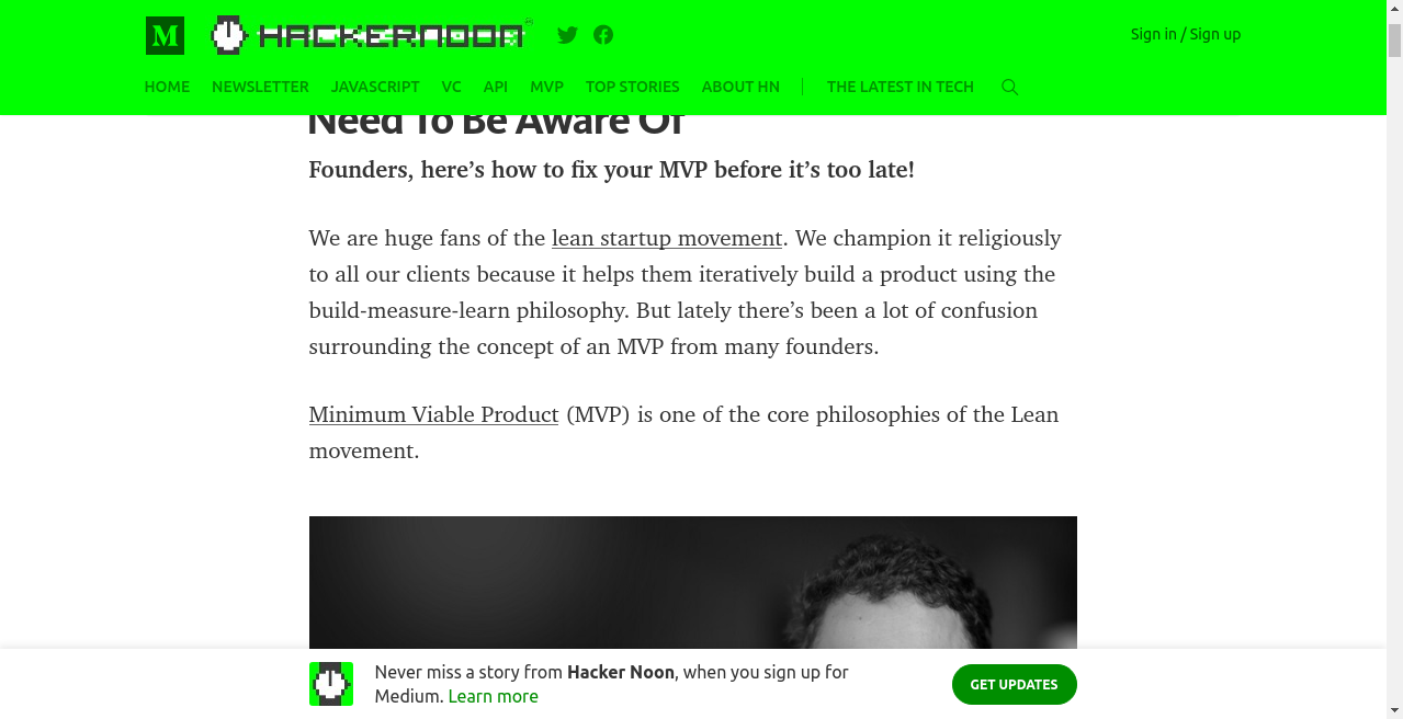
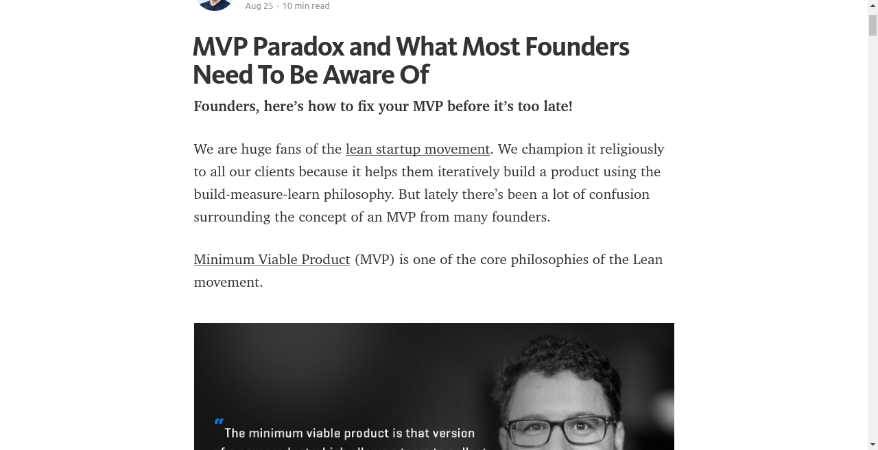
makes especially the top one more legible, the bottom bar doesn't bleed into the next image.
1.5 KiB
Make Medium Readable Again
I've gotten a little tired of showing up to a Medium-powered site on a non-medium.com domain and getting badgered to Sign Up! or Get Updates! when I'm already a Medium user. It's also annoying to have a vertically-small reading viewport because the top and bottom nav bars don't auto-hide. I know -- Who owns a 12.1" laptop anymore?, right? Well... today I decided I couldn't abide that anymore, and made a Chrome extension to neutralize these user hostilities.
This is that Chrome extension. Install it here.
Improves readability by
- Keeping the top navigation bar from sticking around
- Hiding the bottom "Get Updates" bar completely
- (Optionally) hiding the clap / share bar
Preview
Contributing
Want to improve something? Your insight is welcome here! Send a pull request!
License
MIT
Credits
I'm Matt Baer, and I'm tired of annoying, user-hostile software. So I built a publishing space called Write.as that doesn't beg you to sign up, lets you read, and leaves out the comments, claps, and dickbars. It's great if you just want to be left alone to get your thoughts out. And if you get lonely, you can always publish straight to Medium.

